1,5
Specialist law firm within renewable energy and sustainability
A creative company of designers and craftsmen making fantastical spaces.

The A stands for Artisan obviously, but also for Art deco or even Anarchy. Strong architectural references, or the feeling of disorder and chaos in the process before the pieces start falling into place, are all parts of everyday life at Artisan Tech.

Biblo Tøyen was designed to enrich the library experience for children aged 10-15 by inviting play, interaction and discovery fueled by an imaginative interior.
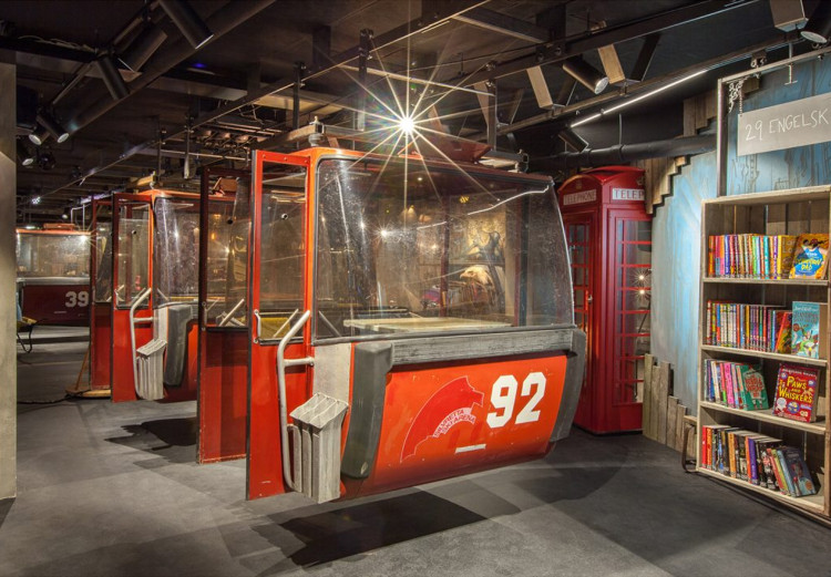
It was developed as an a-typical culture house, that would speak to the audience through, shape, colour, light, texture—a highly tactile experience derived from Deichman’s motto: Hold Deg Våken! (Keep yourself awake!). Photos: Marco Heyda
Challenging the industry by doing things differently Artisan Tech is adhering to imaginative and unconventional ideas, charming smiles and real emotions. They create fantastic experiences for people within public spaces, libraries, or museums, and make space for free-thinking for everyone to enjoy.

Frontend / design with Oliver T. Edwards
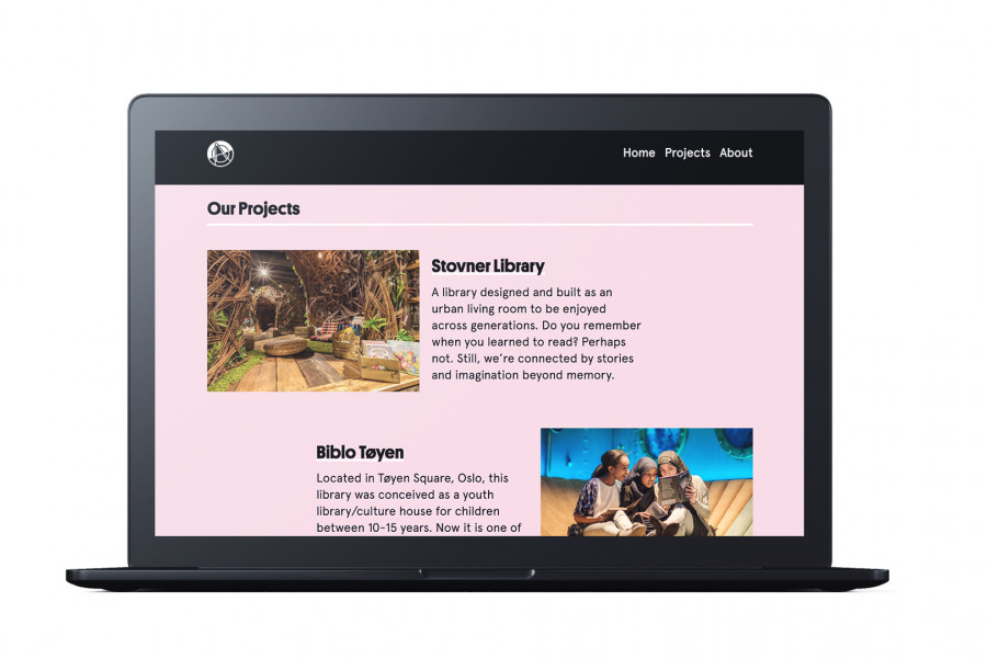
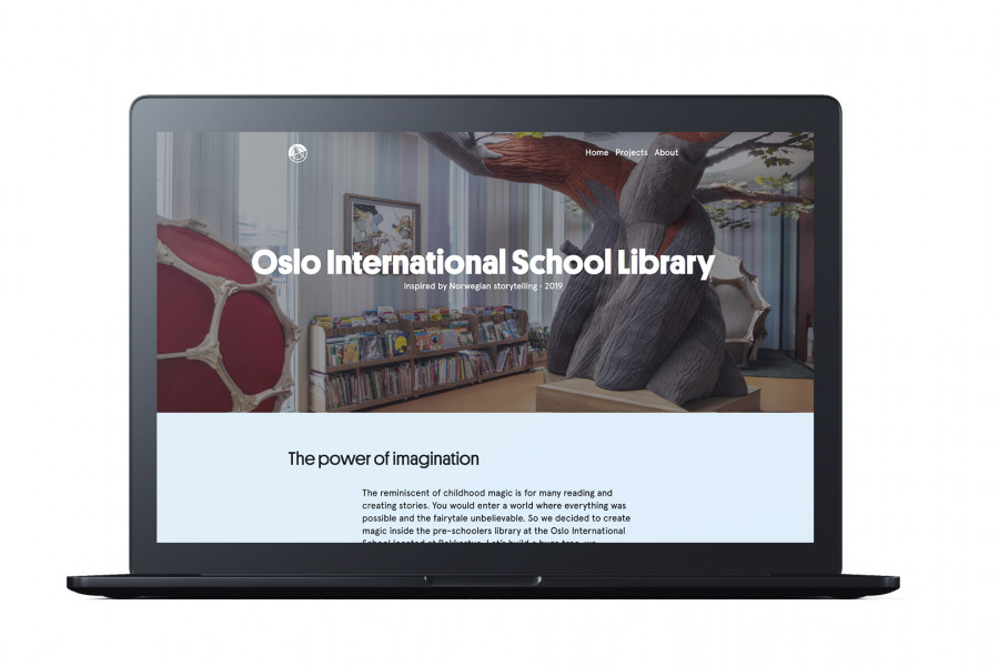
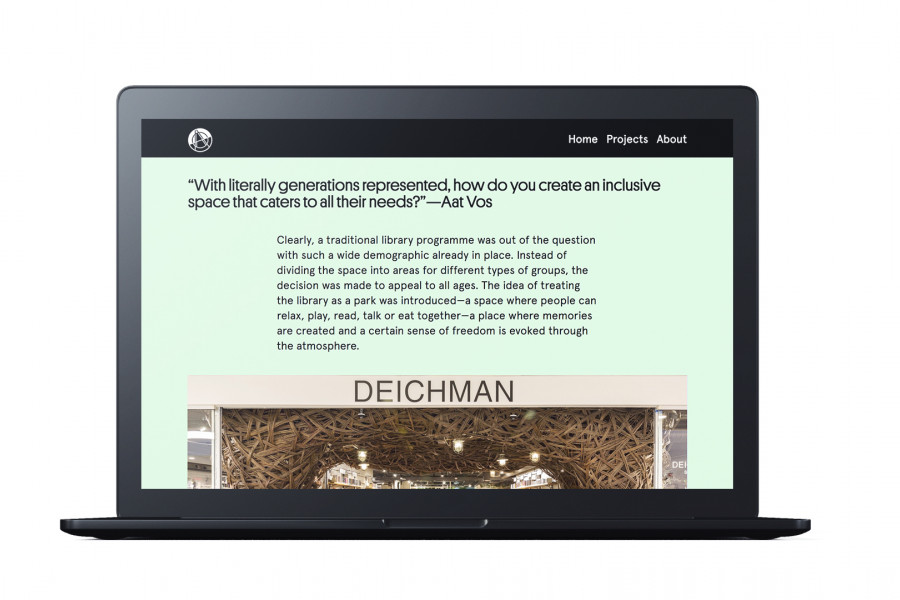
The website is presenting the interiors built by Artisan Tech through large images, a minimalistic layout, typography with art deco references (by Commercialtype) and a magical colour-morphing background.
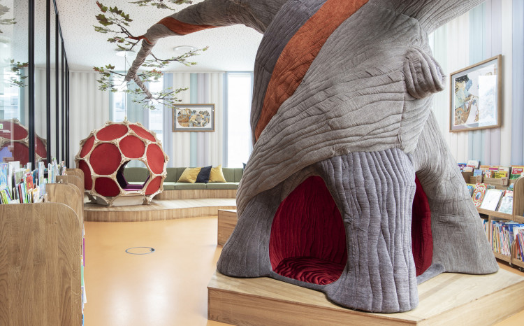
Creating magic inside the pre-schoolers library at the Oslo International School located at Bekkestua with a huge tree!
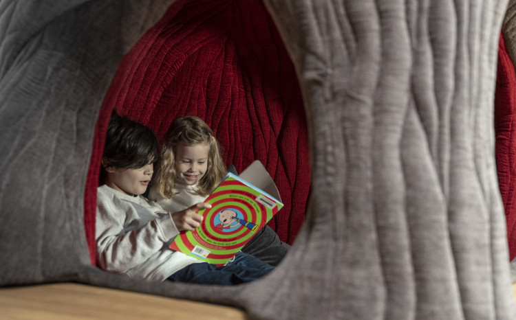
Inspired by the rich gallery of Norse Mythology, the main object in the room is the Yggdrasil, a 2,7-meter high tree structure. Its branches reach up to the ceiling and out into the whole of the space, covered with maple leaves. Kids can climb into the trunk of the tree and enjoy their books in an enclosed and soft space.
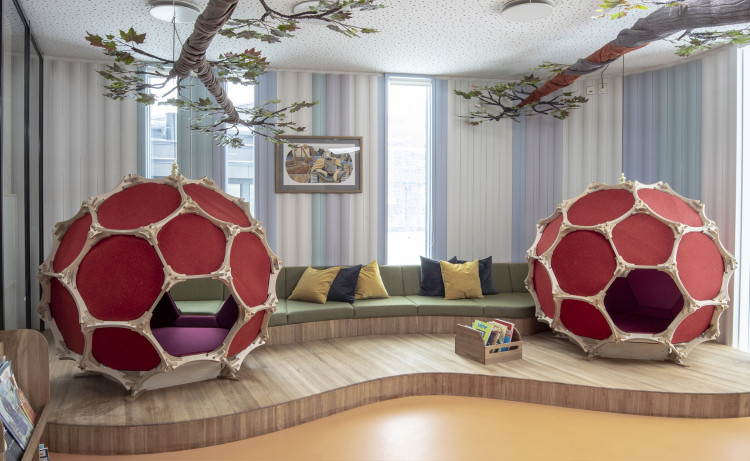
At the end of each branch you find, The Nests. Geodesic shaped reading nooks, covered in wool felt. Photos: Melissa Hegge
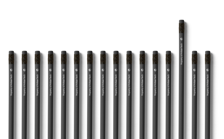
In addition to stamps for marking sketches and original drawings, a set of office supplies was needed. For this a set of supporting graphics was ceated to give the identity life in a playful way. The idea was to deconstruct the logo and use parts of it to symbolise the different pieces coming together to create magical spaces and inspiring experiences.
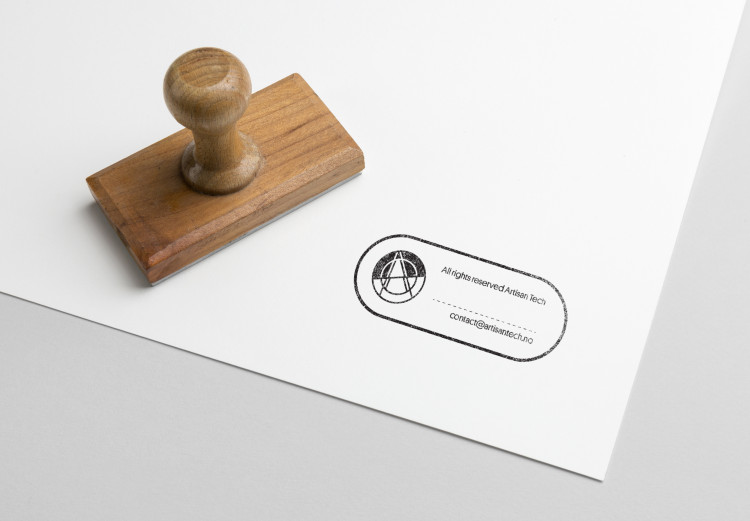
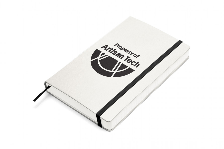
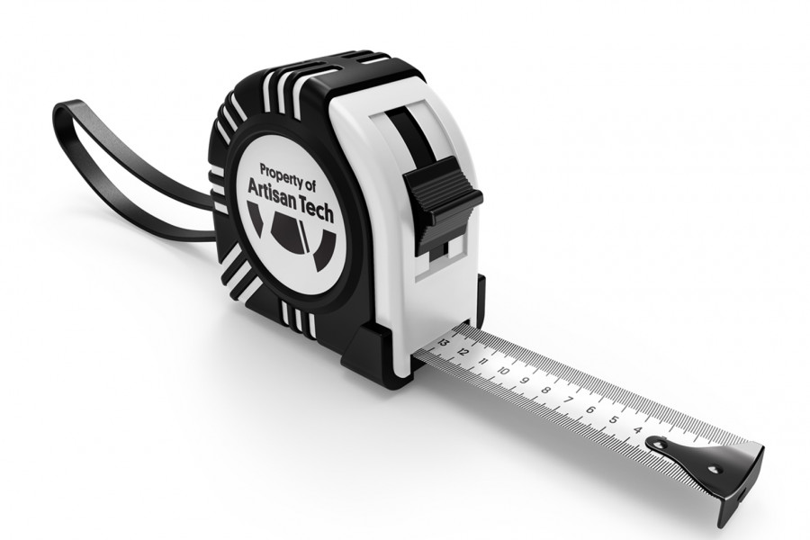
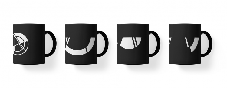
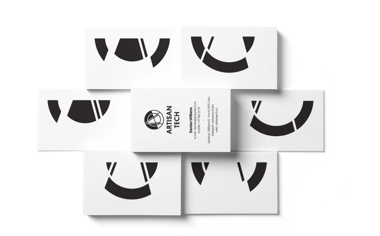
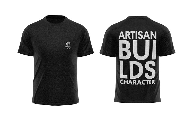
The visual identity itself is a lot cleaner and more “corporate” looking than many of the fantastical spaces Artisan Tech have created. This is a deliberate choice, to express the level of professionalism that you will get when teaming up with this company, but also Artisan Tech does not wish to be assosiated with one particular style or expression.
The purpose is always to create magic but also to build a unique character to the spaces they are creating.
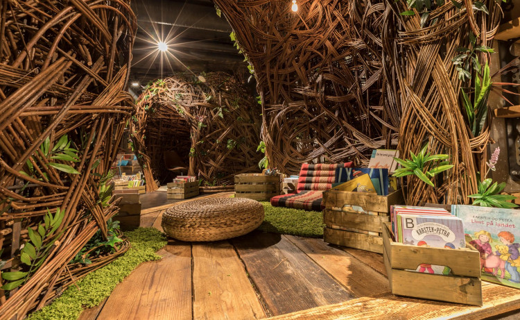
Stovner Library. This “third space” library embraces this thought in creating a fantastical urban living room to be enjoyed across generations. Photo: Marco Heyda
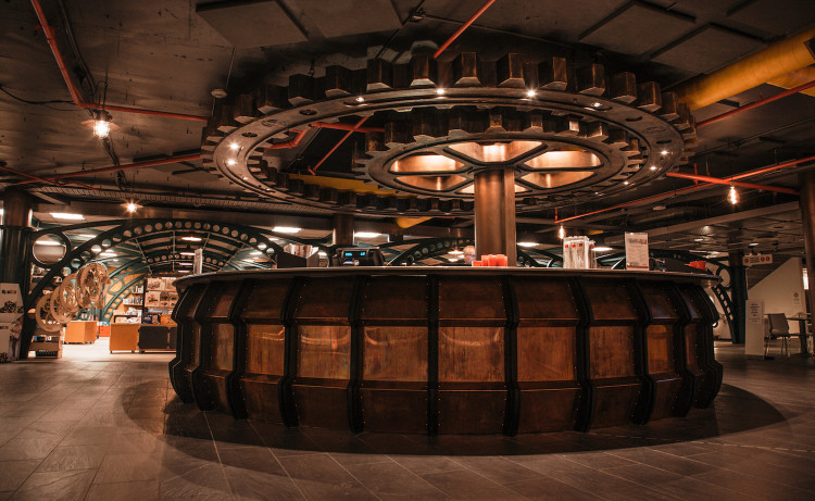
New foyer interior for the Norwegian Museum of Science and Technology in Oslo. Photo: Oliver T. Edwards