Artisan Tech
A creative company of designers and craftsmen making fantastical spaces.
The home of the Kristiania Bohemians in the 1880ies, rebranded for its reopening and total refurbishment.
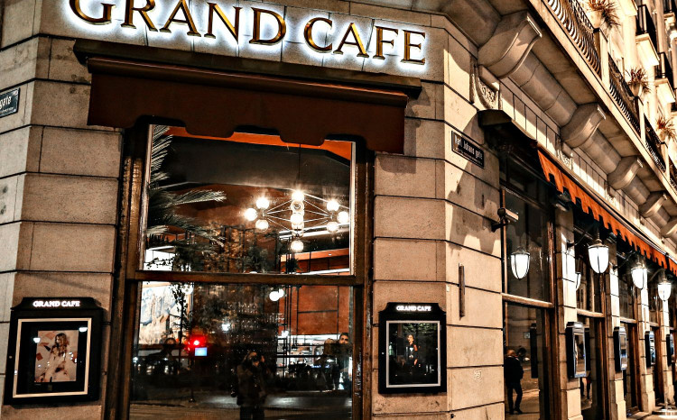
The Grand Café first opened in 1874. In the restaurant, Henrik Ibsen would eat his daily lunch and Edvard Munch once saw his offer to swap the painting ‘Sick Girl’ in return for 100 steak dinners turned down. In 2016, more than 140 years later, a new era has begun. The restaurant reopened in a totally renewed look and an extensive wine cellar.
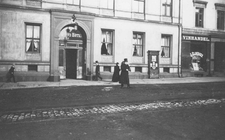
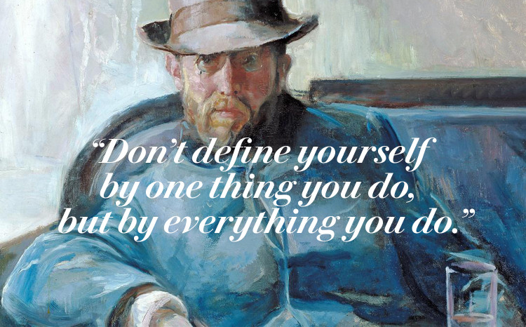
Henrik Ibsen would eat his daily lunch at the Grand Café
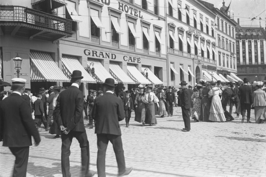
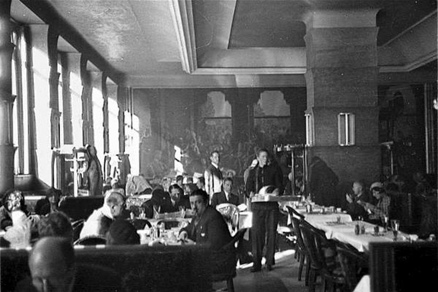
Management of cultural heritage
This was not a typical logo, branding or design project. This was management of cultural heritage and the goal was to create a bridge between history and the present, bringing to life the restaurants past glory in a contemporary context.
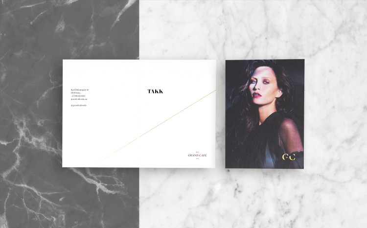
The diagonal / slash is a central graphic element in the identity. Illustrating the bridge between then and now. This symbol is in reference to what NY Times calls the “slash generation”, embracing various careers that overlap and cross-promote each other (IT consultant / photographer / DJ / entrepreneur). This is also relevant for the Kristiania Bohème that were regulars in the restaurants early years (bohemian / writer / anarchist).
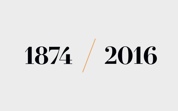

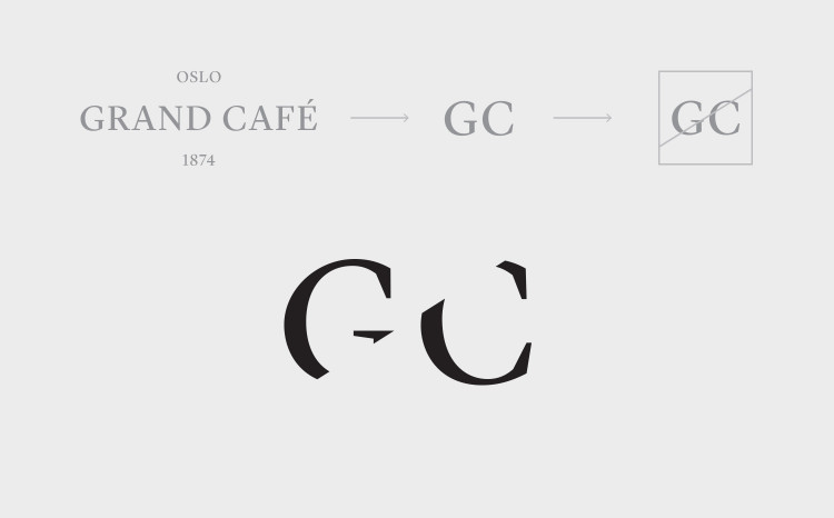
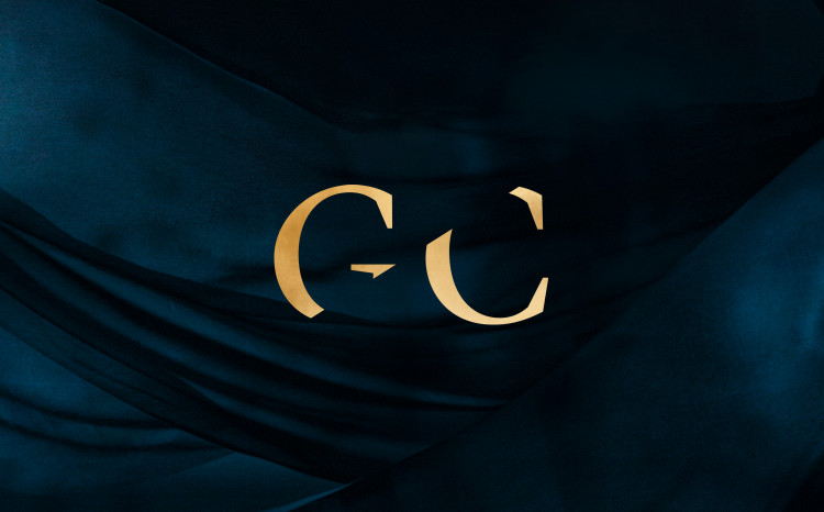
The French Modern typeface of the nineteenth century, often called Didot after the famous French printing dynasty who popularized the style, is the serif typeface of choice to communicate elegance and sophistication. Le Jeune, designed by Commercial Type in 2016, is a perfect choice for a cuisine looking to the modern french brasserie.

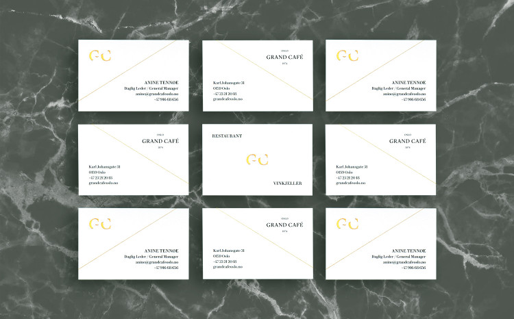
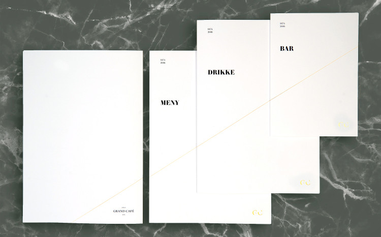
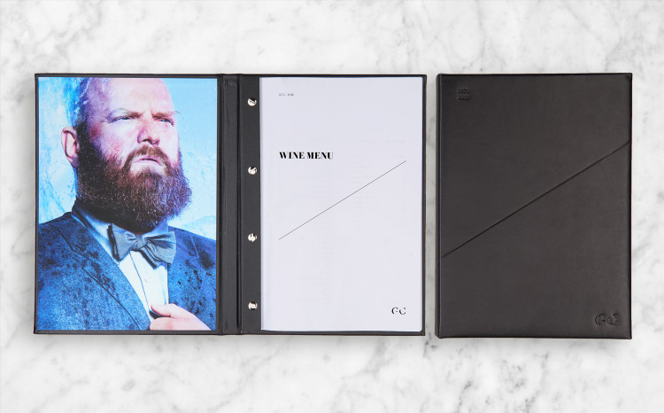
Cards, menus and other elements in the restaurant are minimalistic with a high-end execution through choice of quality paper, a hairline of Luxor gold foiled slash and custom hand crafted leather binding. These elements should not compete for attention with the food, interior or colourful guests.
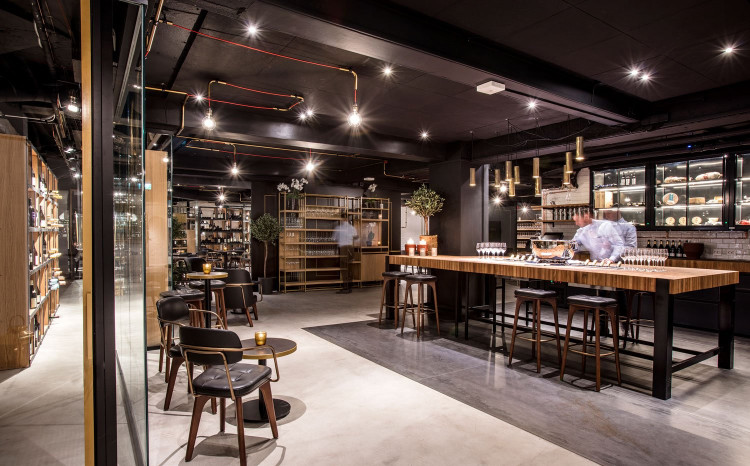
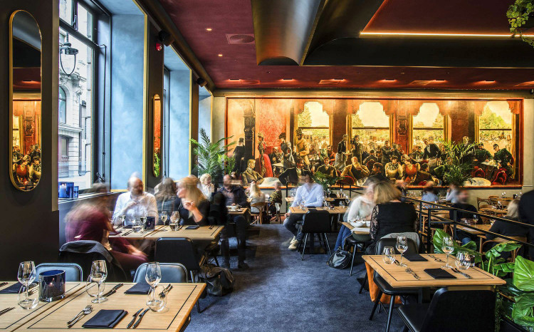
The new interior designed by Radius Design, responsible for the total renovation of the restaurant and wine cellar.
Beside the dining experience one of the main attractions in the Grand Café is Per Krohgs painting from 1928. It shows many of Norways most prominent artists and cultural elite such as Henrik Ibsen and Edvard Munch that were regulars in the restaurants early years.
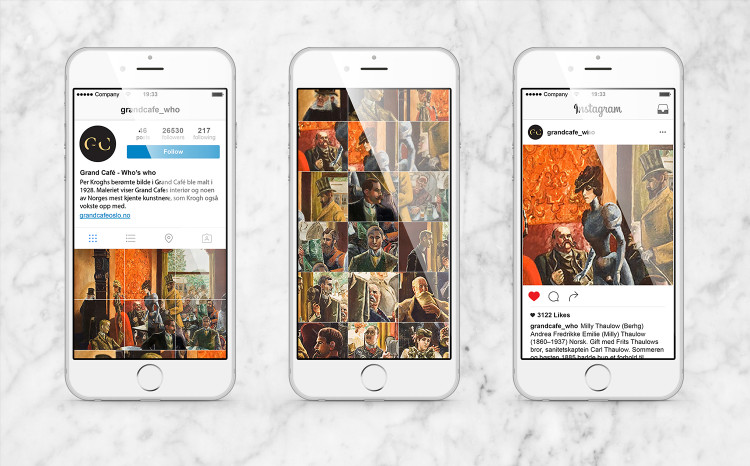
To give guests the full story of the artists and cultural figures in Per Kroghs painting, an instagram account was set up where each person from the painting had its own post with bio, references and fun facts (the bohemian lifestyle was full of passion, drama and intrigues).
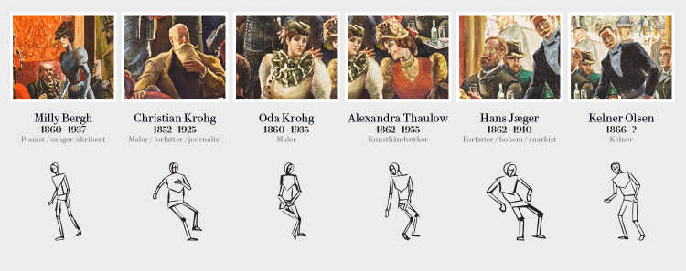
6 of these personalities are used to link todays restaurant to it’s past. With their pose in the painting as a starting point, references from their work and life was used to create portraits of them in a 2016 context. Photos by Baard Lunde
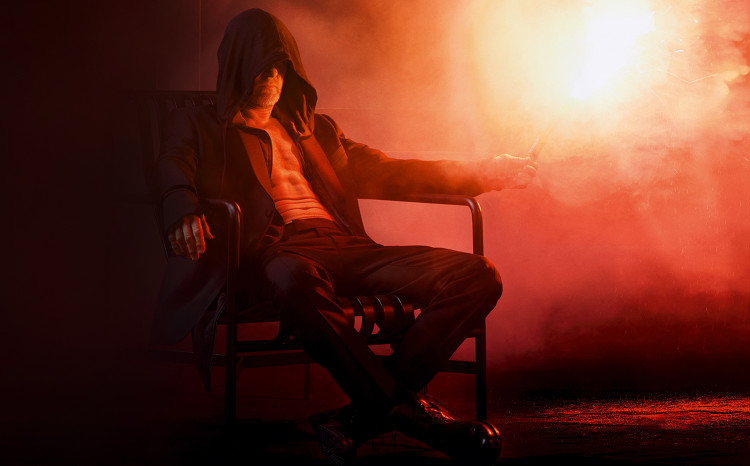
Hans Jæger,
bohemian / writer / anarchist
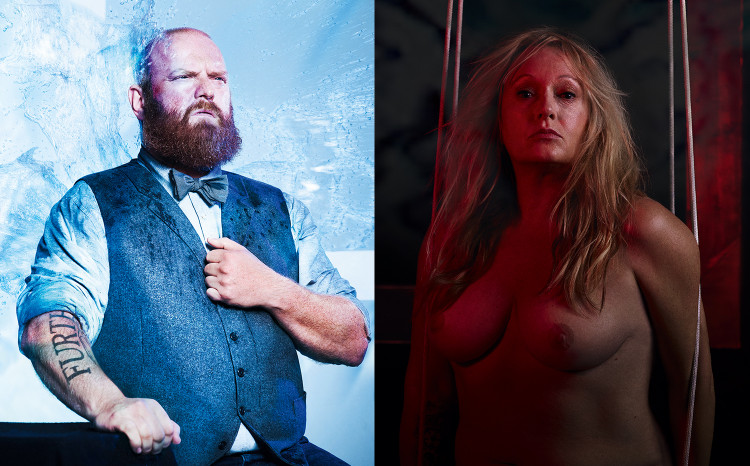
Christian Krohg,
painter / journalist / novelist / Per Krohgs father
Oda Krohg,
feminist / painter / bohemian queen / Per Krohgs mother
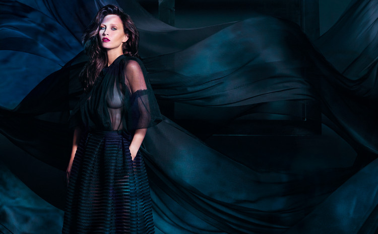
Milly Bergh,
singer / writer / temptress
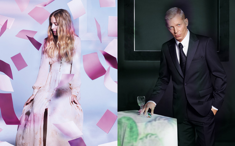
Alexandra Thaulow,
parisian / art-deco artist / wife
Waiter Olsen,
waiter / troublemaker / firestarter
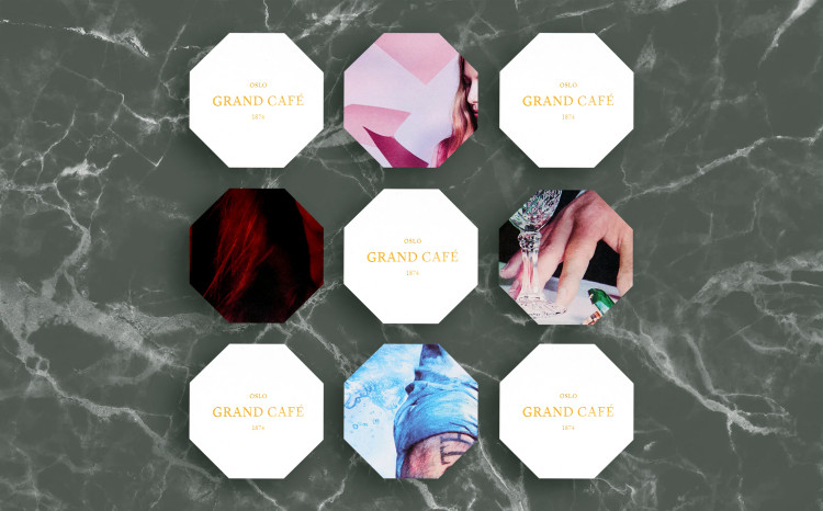
The artwork was used for decoration in the foyer and on some of the printed material, like inside the extensive leather bound wine menu, the receipt folder and octogonal coasters.
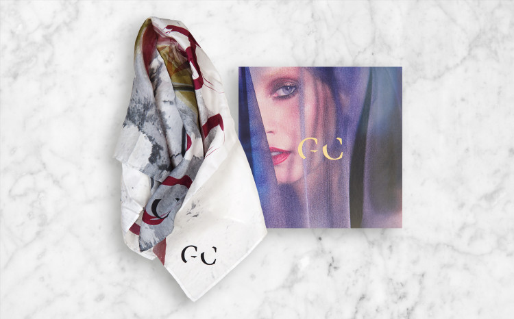
Norwegian fashion label Holzweiler created a custom printed silk scarf with a Munch inspired motive for the restaurants management to wear on special occasions.
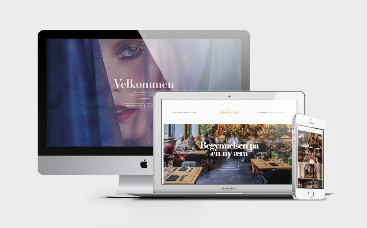
The website was set up with a section for reservations and a part dedicated to the restaurants history.
